Pros and cons of using dark mode
As technology has evolved over time, many users have found themselves experimenting with dark mode on their devices. Dark mode is a display mode for user interfaces, including computers and phones. Instead of the default dark text showing up against a light screen, light color text (white or grey) shows up against a dark or black screen. However, its impact on accessibility remains a topic of debate, so let's explore!
Pros of dark mode
-
Reduced eye strain: Dark mode can significantly reduce eye strain, particularly in low-light environments. The contrast between text and background is less harsh, making it easier for users to read for extended periods without discomfort.
-
Battery saving: For certain, dark mode can contribute to battery saving. Since black pixels consume less power than white ones on such screens, enabling dark mode can extend battery life.
-
Improved visibility for certain users: Individuals with certain visual impairments, such as sensitivity to bright light or photophobia, may find dark mode more comfortable and accessible. It provides a gentler visual experience, allowing for better focus and comprehension.
Cons of Dark Mode:
-
Challenges: While dark mode may benefit many users, it can pose challenges for others, particularly those with certain types of visual impairments, such as low contrast sensitivity or certain types of color blindness. For these users, the reduced contrast in dark mode might make it harder to distinguish between elements on the screen.
-
Lack of consistency across platforms: Dark Mode implementation varies across different platforms and applications, leading to inconsistencies in user experience. Users may encounter issues with readability, functionality, and accessibility when switching between light and dark themes.
-
Accessibility settings override: Dark Mode preferences might conflict with accessibility settings or user preferences set at the system level. This can create confusion and frustration for users who rely on specific accessibility features to navigate digital interfaces effectively.
Example
Below is an example of a challenge of using dark mode. It is difficult to see the signature in dark mode.
Dark mode

Light mode

What can I do?
While you can't change someone's mind on using light or dark mode, you can ensure that your email is accessible by utilizing some of these tips and tricks:
- Ensuring alt text is on all images
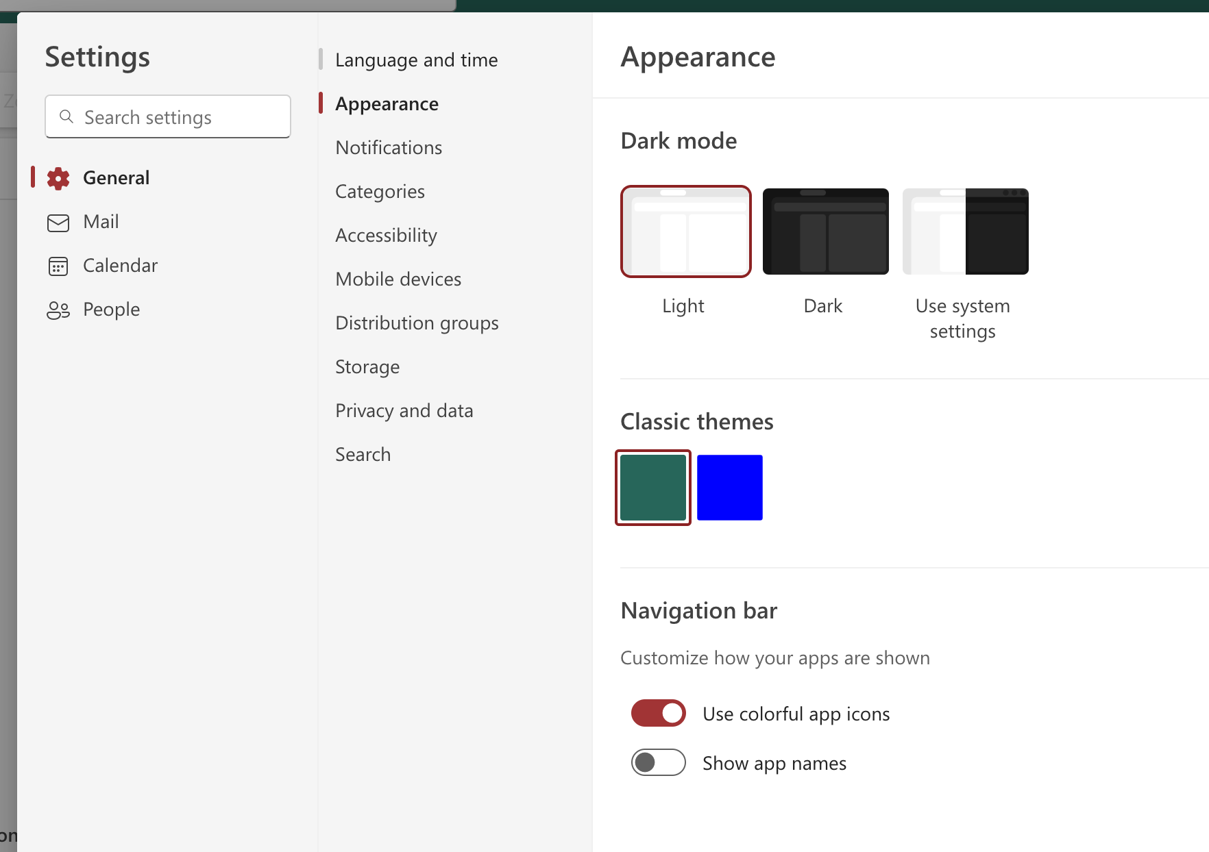
- Turn on Dark Mode in Outlook settings to test out how it will look:
Please let us know if you have any follow-up questions on this topic!