Designing content for screen reader users
Last month, we discussed what screen readers are and how they work. This month, we will discuss how to design content in an accessible way for screen readers. As a quick recap:
Typically, a screen reader will start at the top of a website or document and read any text (including alternate text for images). Screen reader users often move through a website or document by using only the keyboard, as this provides precise navigation. Some screen readers allow the user to preview information, like the navigation bar or all the headings on a page, and skip the user to the desired section of the page. For this reason, using navigation styles like headings is part of creating accessible documents and web pages.
Making content accessible
Alt text
Making images and graphics “visible” to all users is one of the first principles of accessibility. Adding alternative text (alt text) to an image or graphic allows it to be discoverable and understood by users in a variety of ways. For users relying on screen readers or browsing speech-enabled websites, alt text can be read aloud or rendered as Braille.
To create good alt text, you should ask yourself "What is the context and purpose of this graphic/image?" and describe the content and function in text how you would to someone in-person.
Tip: Don't use the words "image of, picture of, photo of etc." in the alt text field as it is redundant. Assistive technology already announces the item is an image.
Headings
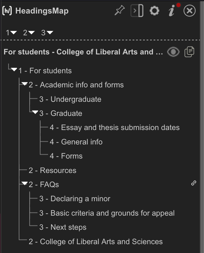
Organizing web pages by headings helps users get a sense of the page's organization and structure. Headings and subheadings are an important usability and accessibility strategy to help readers scan and locate information within a page. A screen reader announces the heading level to the user. Additionally, a user can pull up all of the headings on a page and jump to certain sections of the page. Below are two screen shots of heading lists pulled up in VoiceOver. The first image shows a heading map, which gives a nice visual of the hierarchy of information. The second image shows a list of headings with numbers next to each one to show or tell the user what level the headings are at.

Descriptive links
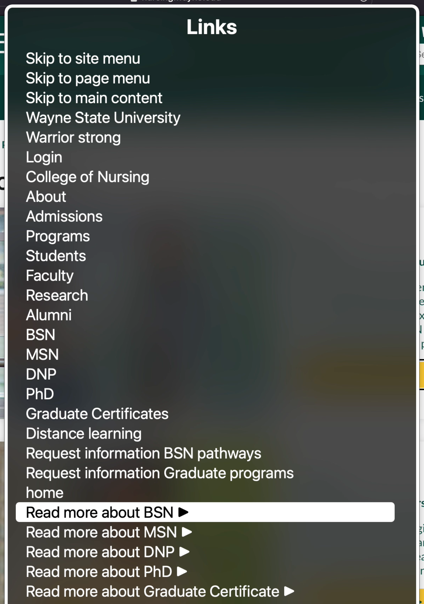 Short, concise links are less likely to frustrate screen reader users than long, imprecise links. Links are more useful when they make sense out of context. Authors should avoid non-informative link phrases such as: click here, read more, link to [some link destination] info, etc. Screen readers will announce the name of the hyperlink after announcing it is a link. Users can also pull up a list of links on a page to select one, as shown below. If someone has the word "here" linked multiple times on a page, the list of links will only say "here" and the user will not be able to know where the link takes them.