Accessibility best practices for emails
Every day, emails are created in the CMS and sent inside and outside of campus. The CMS allows communicators to create and send university-branded emails with accessibility built into the template automatically. Since the content of each email is unique, it is the responsibility of the content creator to ensure anything in between the header and footer is also accessible.
As a public university, we must ensure everything we produce meets the Section 508 guidelines, which means equal access to information, including emails. Like several other institutions, in the last few years, we have gone through a complaint and resolution with the Office of Civil Rights (ORC) due to inaccessible content. As part of the resolution agreement with OCR we continuously evaluate university websites and communication to make sure they are meeting the standards and employees are trained to meet those standards. Since then, WSU has created and implemented standards and policies regarding the accessibility of content being posted.
Email tips
In general, emails follow the same guidelines as accessible web pages, including the ones listed below:
- Put the text of the email as actual text so it can be scaled up/down if needed and can be read by a screen reader. By default, images are turned off on emails and the way this email is setup up it would show nothing in the email until someone allows images. For a non-sighted user, it wouldn't have any content in it.
- We offer HTML email templates with standard or custom headers in the CMS which is what most areas of campus use, and you likely have seen them come through the major lists. In addition to the standard university style, they also give you open and click-through rates on all your links.
- Because the single column HTML email template has padding on the right and left of the text, any images embedded into the email needs to have a width of 525px or under.
- The use of additional PDF attachments is discouraged due to both email size and the ability for someone to open a PDF and the amount of work it takes to make a PDF accessible.
- Focus on 2-3 key points
- Front-load information
- Put the essential and most interesting information at the beginning. Include additional information in order of diminishing importance.
- Use headings to make content scannable (not everyone will read every word on your email but they will read your headings)
- The heading should give a clear idea of what content follows - be specific.
- If you just read your headings would you know what the email was about?
- Keep it simple - less is more!
Example email
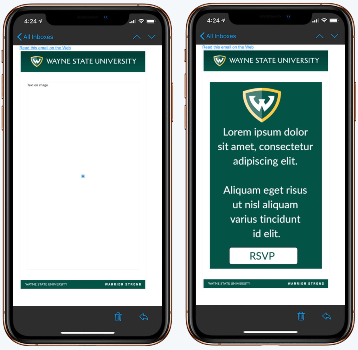
We have created a sample email that includes text on an image. We have included a screenshot of the email below. Not only is a screen reader unable to read the text, but a user cannot highlight text, the text itself is low-resolution and distorted and the button is unable to be clicked. Ideally, the text content should be directly in the email and images can be included to support the text, along with a button created in the CMS email editor.
Images turned off (left), Images on (right)
Resources
- Email accessibility at WSU
- Inserting an image into a CMS email
- Email accessibility checker
- Accessibility training course
Please let us know if you have any follow-up questions on this topic!